Risk Data Analysis

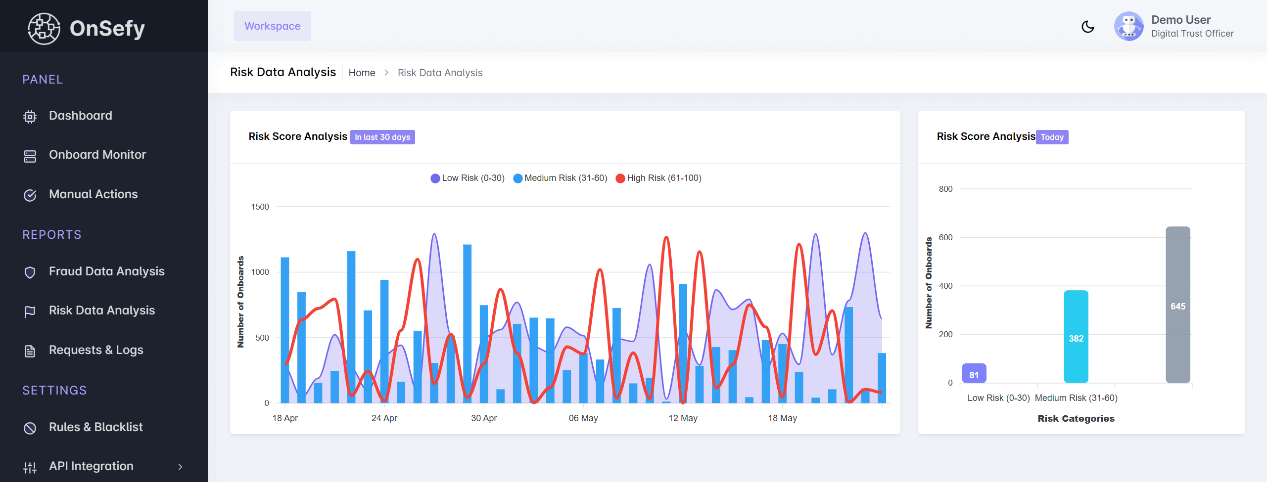
The Risk Data Analysis page provides insights into the risk levels associated with onboarded users. It includes visualizations of risk score distributions and trends over time, helping administrators assess potential threats and suspicious activities.
Risk Data Analysis

Features Overview

🔹 Risk Score Analysis

  • A line and bar chart showcasing the number of onboarded users categorized by risk levels over the last 30 days.
  • Risk categories:
    • Low Risk (0-2) - Represented in purple.
    • Medium Risk (3-5) - Represented in blue.
    • High Risk (5-10) - Represented in red.
  • The chart helps visualize trends in user risk distribution over time.

🔹 Risk Score Analysis - Today

  • A bar chart showing today’s onboarded users categorized by their risk levels.
  • Helps in real-time monitoring of risk trends.

🔹 Key Insights

  • Identify fluctuations in high-risk user onboarding.
  • Compare daily and monthly risk score trends.
  • Track spikes in medium and high-risk users for further investigation.